Instagram photos that look like they belong to the same account
Instagram is judged twice: once as a single post in a feed, and once as a grid of nine when someone lands on your profile. Photos that work individually can still look like a jumble together, and the grid is what decides whether someone follows.
The grid is the first impression, not the post
When someone taps your profile they see roughly nine squares at once, before reading a caption or a bio. What registers in that moment is not the content of any single photo. It is whether the set looks coherent: similar warmth, similar brightness, a consistent sense of place.
Accounts that grow tend to have an obvious visual through-line. Accounts that do not tend to be a collection of good individual photos taken in wildly different light. Coherence is doing more work than quality here, which is unintuitive and consistently true.
Formats and what they cost you
Instagram displays the grid in squares and the feed in portrait. A photo composed for a square loses its top and bottom in the feed; a photo composed for tall portrait gets its edges cropped in the grid. Compose with the subject central enough to survive both, and upload at portrait ratio since that occupies more of the screen in the feed.
Profile photos are a separate problem: a small circle, where the same rules as any profile picture apply. Face large, eyes visible, clear separation from the background.
Consistency without shooting everything on the same day
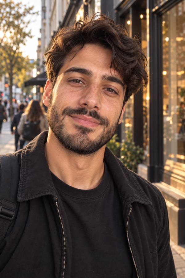
The usual way to get a coherent grid is a single shoot, which is why influencer grids look consistent and normal accounts do not. Generating a set from the same selfies gets to the same place from the other direction: the face is constant, and you choose rooms that share a palette and a light quality.
A run of warm indoor frames, a run of golden hour outdoor frames, and a couple of cooler street frames will sit together. Mixing hard midday sun, a dim bar and a white studio backdrop will not, no matter how good each photo is on its own.
What gets read as AI on Instagram
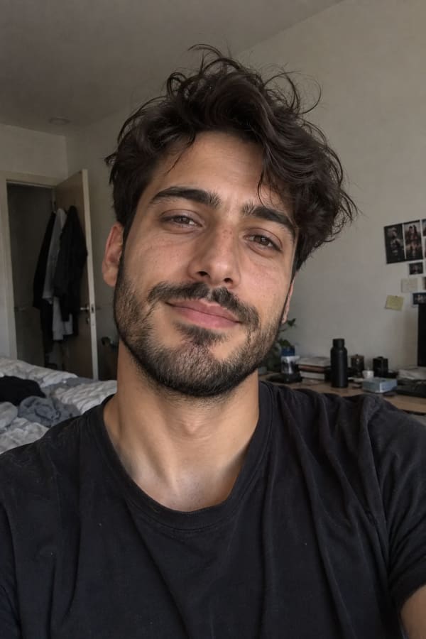
Instagram audiences are unusually good at spotting generated images, because they look at an enormous number of photographs. The tells they react to are not the setting. They are plastic skin, over-symmetric faces, impossibly clean light, and images with no grain.
Keeping skin texture and adding the grain a phone camera would produce at that light level is what makes the difference between a photo that reads as yours and one that gets called out in the comments.
Where these photos go
Settings that work
Common questions
What size should Instagram photos be?
Upload at 1080 pixels wide. Portrait at 4:5 occupies the most feed space. Remember the grid crops to a square, so keep the subject central.
Does Instagram allow AI generated images?
Yes. Instagram labels content it detects as AI generated rather than removing it, and expects you not to present generated images as something they are not.
How do I make my grid look consistent?
Keep the light and colour temperature in a similar range across posts. Consistency of palette does more for a grid than the quality of any single photo.
Why do my photos look worse after uploading?
Instagram compresses on upload. Export at 1080 pixels wide rather than uploading a much larger file, and avoid heavy grain or fine detail that compression will smear.
How many photos do I need to start?
Nine fills the visible grid, which is what someone sees when deciding to follow. Below that the profile reads as unfinished.
Will people be able to tell they are AI?
They notice smoothed skin, over-symmetric faces and images with no grain. Keeping texture and adding real sensor grain is what closes that gap.
From $14.99/mo · Cancel anytime